The Prof-UIS toolbar provides many additional features not available in MFC:
- When you drag or resize a toolbar, its entire image is displayed, not only its outline
(see Figure 1).
- Built-in split button, which is divided into two parts. By clicking
the left part, you fire the command associated with this button. You can assign another command to this button
by clicking its right part (identified with a down arrow) and selecting the required command from the drop-down list
(see Figure 2).
- Chevron button, which is the right-most button on any Prof-UIS toolbar. By right-clicking it, you can see the toolbar buttons
that cannot fit the toolbar area when it is docked. With the chevron button, you can also quickly customize the toolbar
(see Figure 3).
- Customize dialog and completely customizable toolbars, menus, and keyboard accelerators
(see Figure 4).
- Quick toolbar customization with the "Add or Remove Buttons" submenu available from the chevron button
(see Figure 5).
- ALT customization (without the Customize dialog). By pressing and holding the ALT key, you can move, copy, or remove any toolbar button or menu item with the mouse pointer
(see Figure 6).
- Consistent resizable combo/edit/date fields
(see Figure 7).
- Undo/redo button
(see Figure 8).
- Color picker button with a color pop-up menu
(see Figure 9).
- Sliders/scroll bars button
(see Figure 10).
- Built-in context menu over areas occupied by the menu bar, toolbars and/or resizable control bars in the frame window
(see Figure 11).
- Alpha icons for disabled toolbar buttons in the Microsoft Office 2003 and Visual Studio 2005 themes when high/true color monitor mode is turned on
(see Figure 12).
- Large icons
(see Figure 13).
- Text support for toolbar buttons: You can customize any toolbar button so that the toolbar can display its icon, its text, or both its icon and text
(see Figure 14).
Prof-UIS also allows the user to dock the toolbar to any side of the frame window or make it floating (see Figure 15).
The developer can draw its own buttons in a new, customized fashion and put them on the toolbar (see Figure 16).
The toolbar is fully compatible with the OLE client/server
technology, which means it is automatically hidden when an OLE
object becomes in-place active and vice versa (see Figure 17).
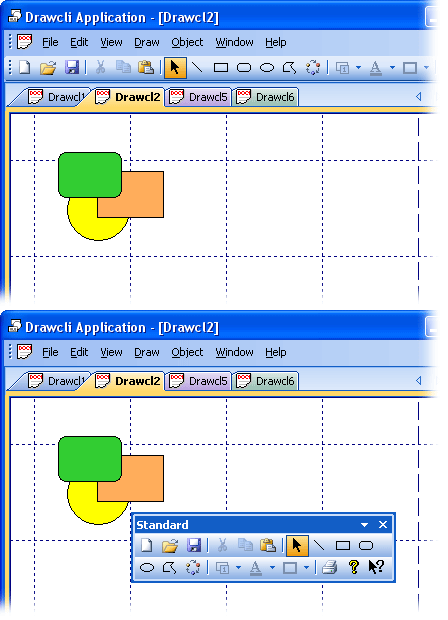
Figure 1. Displaying the entire image of the toolbar while it is being dragged/resized
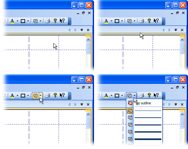
Figure 2. Split button in a toolbar
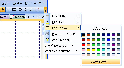
Figure 3. Toolbar chevron button
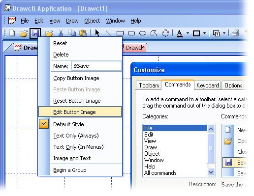
Figure 4. Customize dialog and completely customizable toolbars, menus, and keyboard accelerators
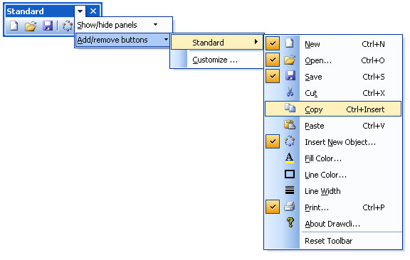
Figure 5. Quick toolbar customization with "Add or Remove Buttons"
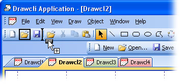
Figure 6. ALT customization (without the Customize dialog)
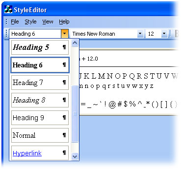
Figure 7. Consistent resizable combo field in a menu
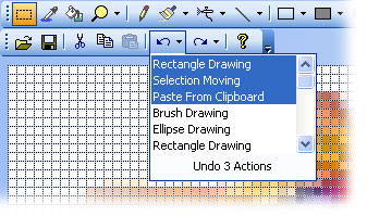
Figure 8. Undo/redo button with its drop-down menu
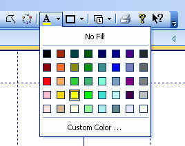
Figure 9. Color picker button with a color pop-up menu

Figure 10. Slider ("Zoom") and a scroll bar ("Seek") in a toolbar
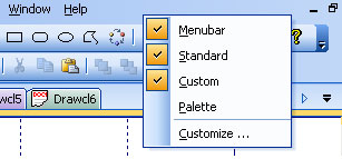
Figure 11. Built-in context menu over the area occupied by docked toolbars and the menu bar

Figure 12. Alpha icons for disabled toolbar buttons (Microsoft Office 2003 and Visual Studio 2005 themes)
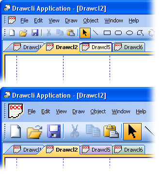
Figure 13. Large icon mode
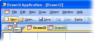
Figure 14. Text support for toolbar buttons
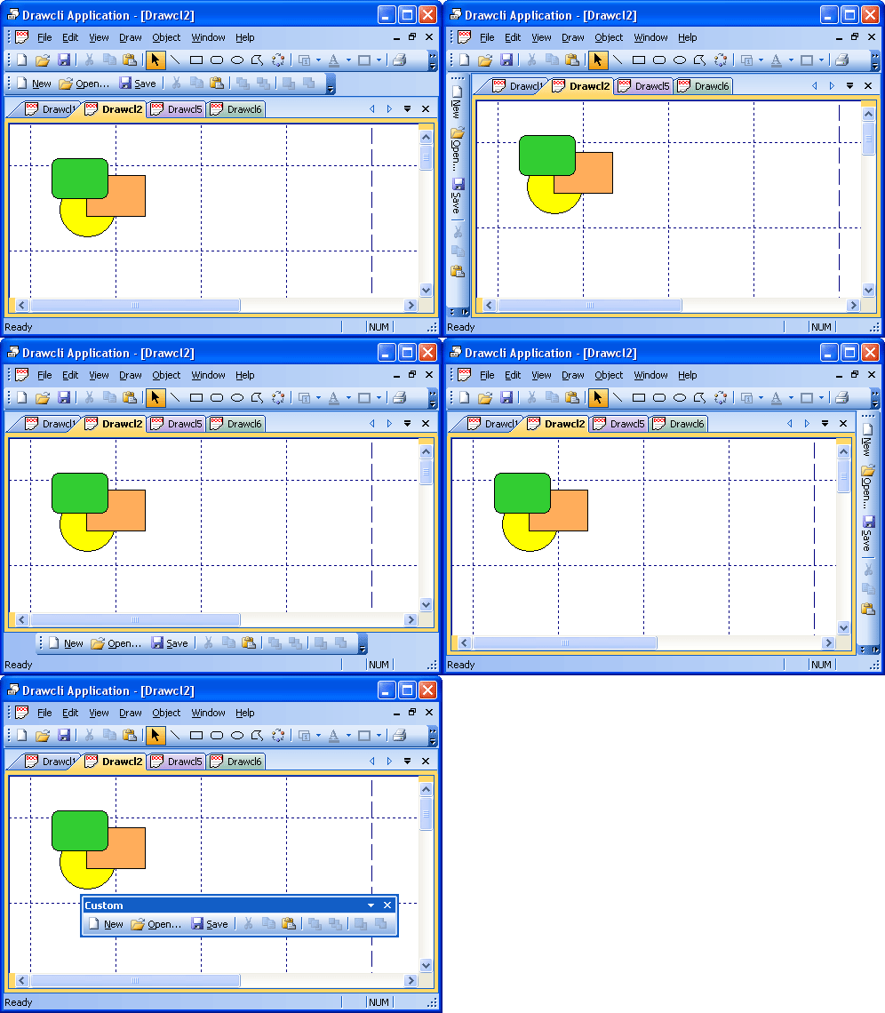
Figure 15. Toolbar docked/floating states
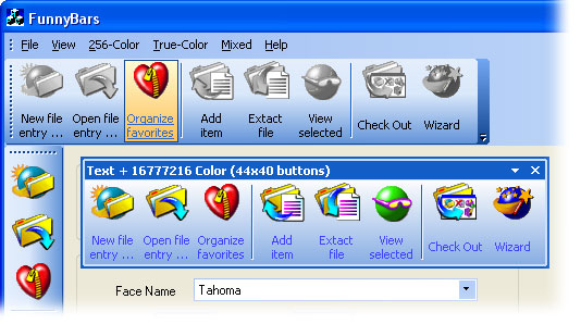
Figure 16. Toolbar custom-drawn buttons
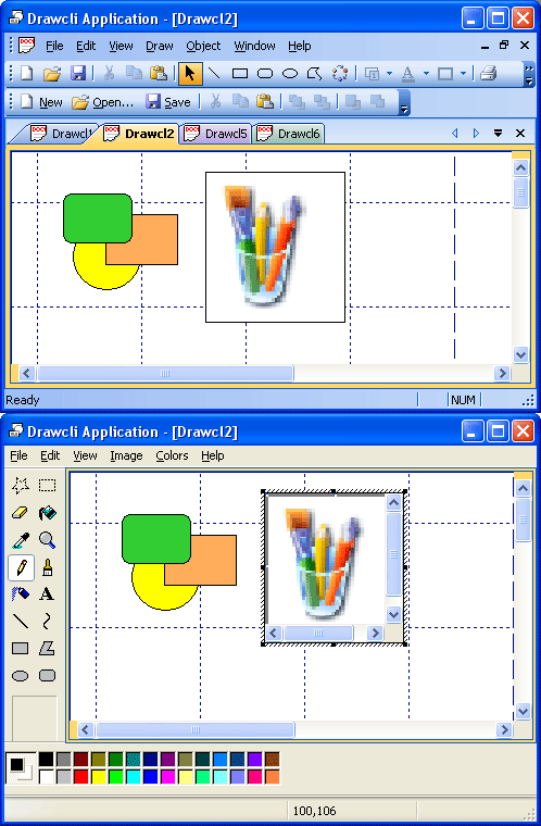
Figure 17. Support for the OLE client/server technology